SystemsBio
The final module of the platform is divided into three submodules: Drug connectivity, Cell profiling and WGCNA.
Drug connectivity
In the Drug connectivity submodule, users can correlate their signature with more than 5000 known drug profiles from the L1000 database, as well as with drug sensitivity profiles from the CTRP v2 and GDSC databases. Additionally, a separate list of shRNA- and cDNA-perturebed datasets from the L1000 database is also available (gene/L1000).
An activation-heatmap compares drug activation profiles across multiple contrasts. This facilitates to quickly see and detect the similarities between contrasts for certain drugs.
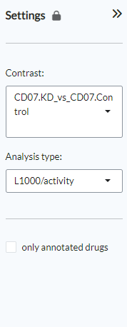
Settings panel
In the Settings panel, users can specify the contrast of their interest
with the Contrast setting. Under Analysis type users can select from four
databases, including the L1000 drug connectivity map (L1000/activity), the L1000 gene perturbation (L1000/gene) database, the CTRP v2 drug sensitivity (CTRP_v2/sensitivity) database and the GDSC drug sensitivity (GDSC/sensitivity) database (default: L1000/activity). The only annotated drugs option is used to exclude drugs without a known mechanism of action.
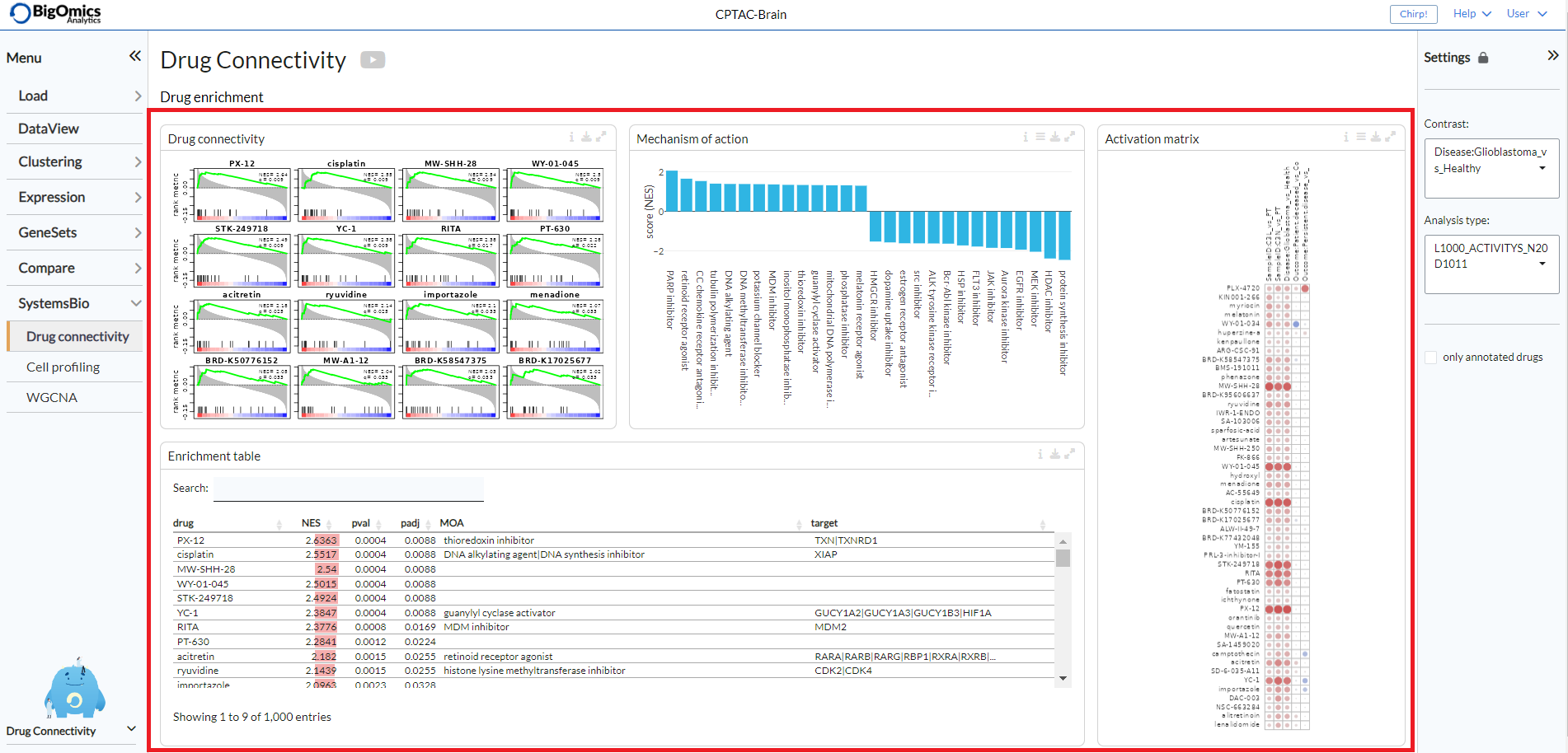
Drug enrichment
There are four main panels in the Drug enrichment tab:
- Drug connectivity:
The Drug Connectivity panel correlates your signature with profiles from the L1000 (activity/L1000 and gene/L1000), CTRP and GDSC databases. It shows the top N=12 similar and opposite profiles as GSEA plots by running the GSEA algorithm on the contrast-drug profile correlation space.
- Enrichment table:
Enrichment is calculated by correlating your signature with the profiles from the chosen database. Because of multiple perturbation experiments for a single small molecule, they are scored by running the GSEA algorithm on the contrast-small molecule profile correlation space. In this way, we obtain a single score for multiple profiles of a single small molecule. The table can be customised via the table Settings to only show annotated drugs.
- Mechanism of action:
This plot visualizes the mechanism of action (MOA) across the enriched drug profiles. On the vertical axis, the number of drugs with the same MOA are plotted. You can switch to visualize between MOA or target gene. Under the plots Settings, users can select the plot type of MOA analysis: by class description (
drug class) or by target gene (target gene). They can also apply q-value weighting for NES scoe values (q-weighting).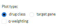
- Activation matrix:
The Activation matrix visualizes the correlation of small molecule profiles with all available pairwise comparisons. The size of the circles correspond to the strength of their correlation, and are colored according to their positive (red) or negative (blue) correlation to the contrast profile. The matrix can be normalised via the settings icon by ticking the
normalize activation matrixoption.
This tab can have many applications, which include understanding the MOA of a novel compund, identifying drugs that can be repurposed for treating a disease, identifying suitable partner drugs for the tested compound or target genes for intervention.
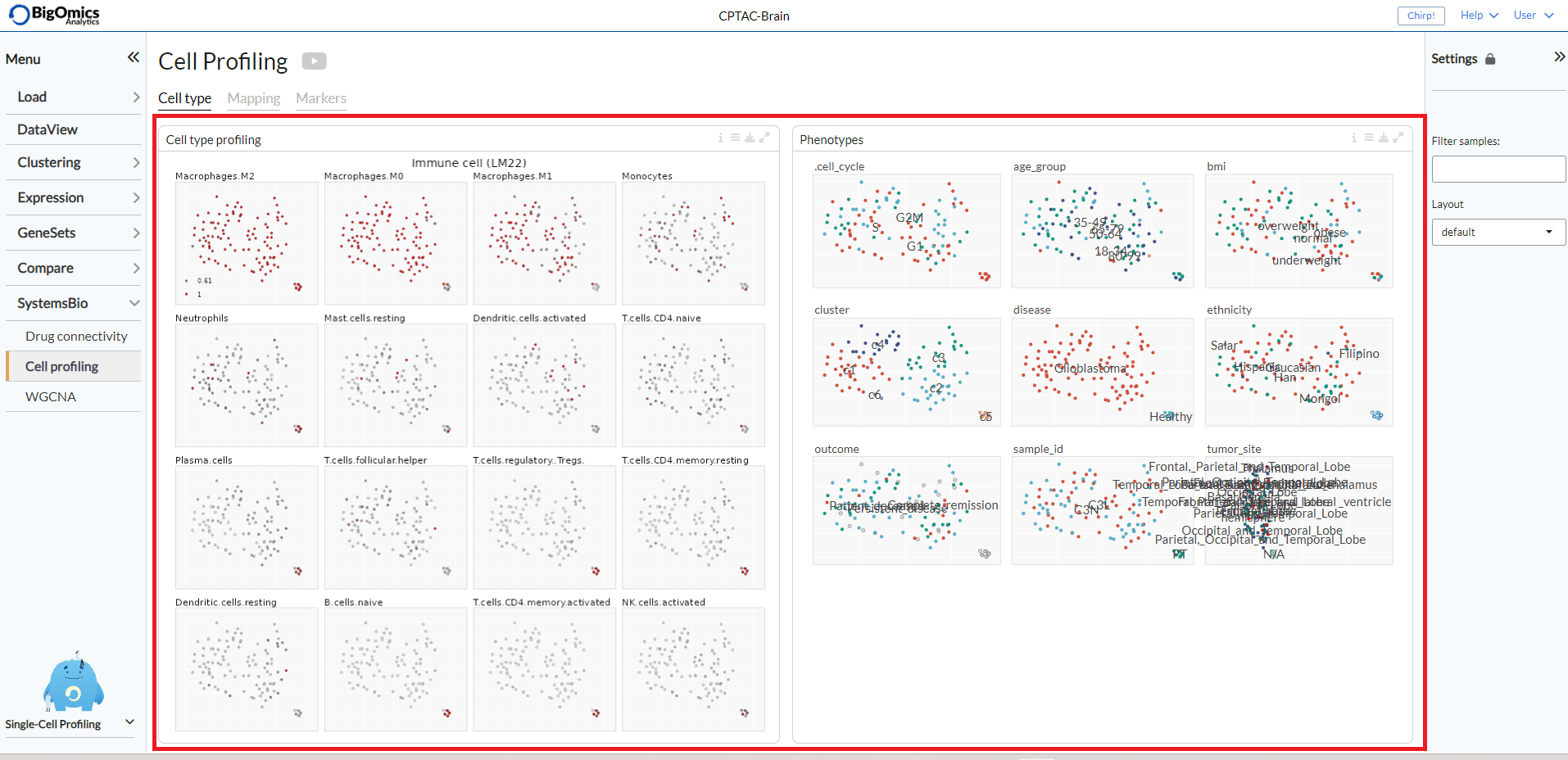
Cell Profiling
The Cell Profiling tab is specifically developed for the analysis and visualization of single-cell datasets. The main applications are identification of immune cell types and visualisations of markers, phenotypes, and proportions across the cells.
The Cell type tab infers the type of cells using computational deconvolution methods and reference datasets from the literature.
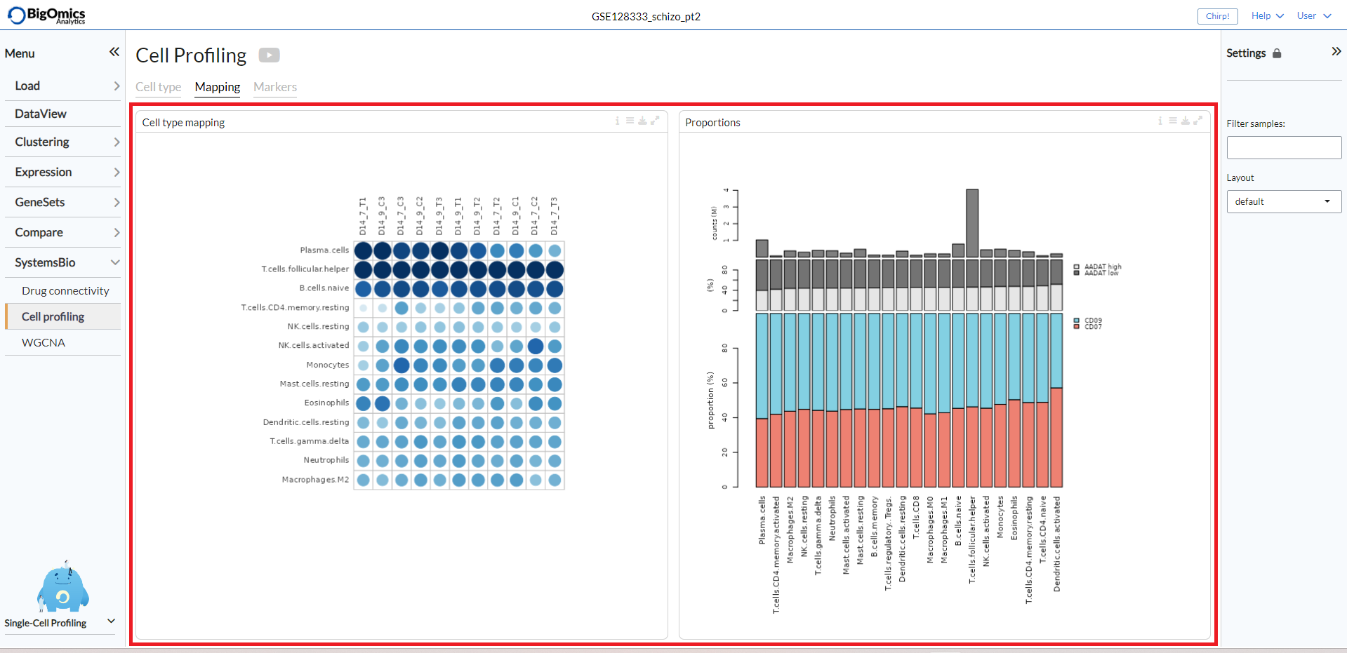
The Mapping tab provides a visualization of the inferred cell types matched to the phenotype variable of the data set, as well as a proportion plot visualizing the interrelationships between two categorical variables (so-called cross tabulation). This can be used to study the composition of a sample by cell type, for example.
The Markers tab provides potential marker genes, which are the top genes with the highest standard deviation within the expression data across the samples. It also generates a plot mimicking the scatter plots used for gating in flow cytometry analysis.
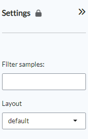
Settings panel
Users can filter relevant samples in the Filter samples settings
under the the main Options in the input panel. They can also
specify the layout for the figures by chooisng between pca, tsne or umap options (default: tsne).
Cell type
The Cell type tab contains two panels: Cell type profiling and Phenotypes.
Cell type profiling infers the type of cells using
computational deconvolution methods and reference datasets from the
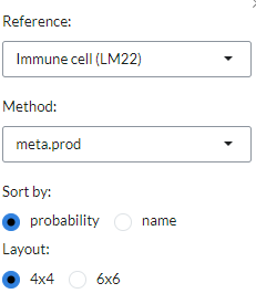
literature. In the plot settings menu, users can select the
reference dataset and the method for the cell type prediction in the
reference and method settings, respectively. Currently, we
have implemented a total of 7 methods (EPIC, DeconRNAseq, DCQ, I-NNLS,
NNLM, correlation-based and a meta-method) and 9 reference datasets to
predict immune cell types (4 datasets: LM22, ImmProt, DICE and
ImmunoStates), tissue types (2 datasets: HPA and GTEx), cell lines (2
datasets: HPA and CCLE) and cancer types (1 dataset: CCLE). Not all
methods or databases may be available for a dataset, the availability
depends on the pre-processing done. From the settings, users can also
sort plots by either probability or name and change the layout (sort by).
The Phenotypes tab displays plots that show the distribution of the phenotypes superposed on the t-SNE clustering. Often, we can expect the t-SNE distribution to be driven by the particular phenotype that is controlled by the experimental condition or unwanted batch effects. Users can customise the plot via the settings icon, where they can label the plot groups or add a legend instead.

The cell type profiling tab displays the two panels side by side.
Mapping
The Mapping panel contains two panels.
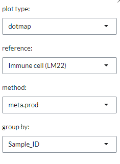
The Cell type mapping panel contains a plot representing the cell type mapping across all samples.
This plot can be customised via the Settings menu. Through it, users can change
the plot type between a dotmap and a heatmap and select the reference dataset,
select the analysis method. The reference datasets and the methods available are the same as indicated in the Cell type profiling panel under the Cell type tab.
Users can also use group by to group samples by input phenotypes.
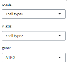
The Proportions panel contains a proportion plot visualizes the overlap between two categorical variables.
This may be useful for bulk RNA datasets, as it can provide information about
the proportion of different cell types in the samples. From the settings icon, users
can select whwther to display the <cell type> (based on the chosen reference dataset)
or select one of the available phenotypes on the x- and y-axes of the plot.
By selecting a gene with gene they can also add an expression barplot that indicates the expression level (high or low is based on average sample expression for the gene) of the selected gene for each of the sample groups as well as adding the total number of read counts of the selected gene per sample group.
The two panels are displayed side by side in the tab.
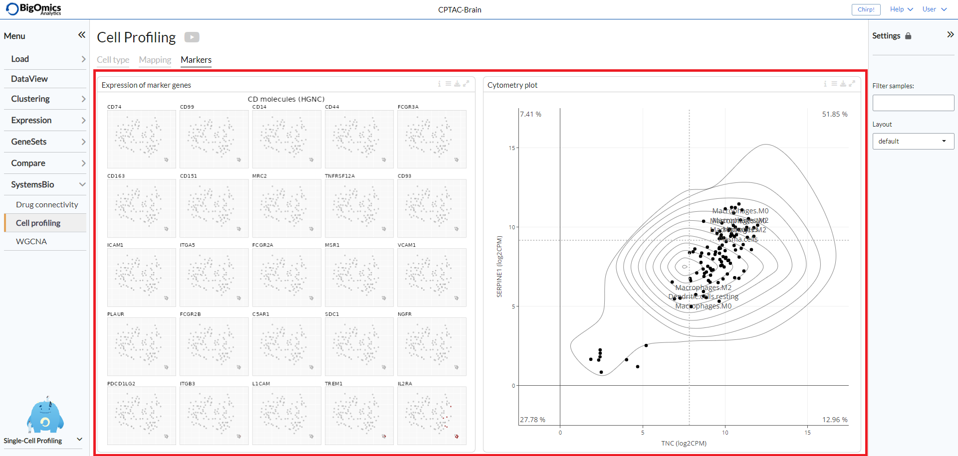
Markers
The Markers tab consists of two panels: Expression of marker genes and Cytometry plot.
Expression of marker genes consists of 25 t-SNE
plots of the genes with the highest standard deviation that could represent
potential biomarkers. The red color shading is proportional to the (absolute)
expression of the gene in corresponding samples.
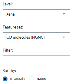
In the settings icon, users can specify the Level of the marker analysis:
gene or gene set level. They can also restrict the analysis by selecting a particular
functional group in the Feature set, where genes are divided into 89 groups, such as
chemokines, transcription factors, genes involved in immune checkpoint inhibition, and so on (default: CD molecules (HGNC)).
In addition, it is possible to filter markers by a specific keywords in the Filter setting
and sort them by intensity (default) or name (sort by).
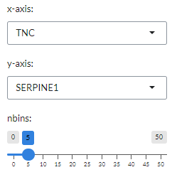
For each gene pairs combination, the panel also generates a cytometry-like plot (Cyto plot)
of samples. The aim of this feature is to observe the distribution of samples
in relation to the selected gene pairs. For instance, when applied to single-cell
sequencing data from immunological cells, it can mimic flow cytometry analysis and distinguish
T helper cells from other T cells by selecting the CD4 and CD8 gene combination.
Under the plot settings icon, users can select their prefered genes on the x- and y-axes
in the x-axis and y-axis, respectively. They can also set the maximum number of bins for histgram distribution (nbins).
This will be used to calculate the density distribution of the gene pairs selected in the x-axis and y-axis.
The two panels are displayed side by side in the tab.
WGCNA
The final submodule under SystemsBio is dedicated to weighted correlation network analysis (WGCNA), which serves the purpose of identifying clusters (modules) comprising highly correlated genes. These clusters can be summarized using either the module eigengene or an intramodular hub gene. WGCNA also facilitates the association of modules with each other and external sample traits through eigengene network methodology. Furthermore, it allows for the computation of module membership measures.
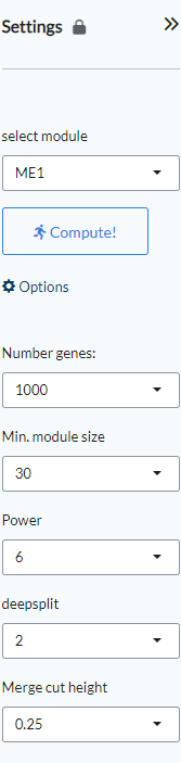
Settings panel
WGCNA modules are selected from the Settings panel (select module) and plots can be recalcluated based on the selected module.
Under Options, the number of genes (Number genes, default=1000), the miinum module size (Min. module size, default=30), the Power (default=6), the deepsplit (default=2) and the Merge cut height, default=0.25) can be set.
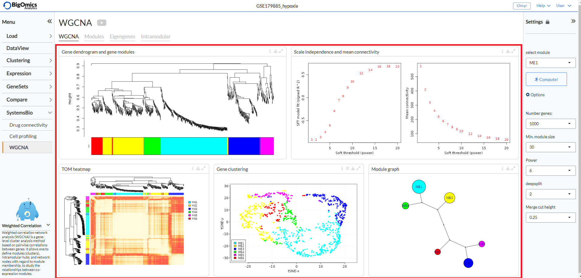
WGCNA
The WGCNA tab consists of fiive panels (from left to right and top to bottom): Gene dendrogram and gene modules, Scale independence and mean connectivity, TOM heatmap, Gene clustering and Module graph.
- Gene dendrogram and gene modules:
In this panel, gene modules are detected as branches of the resulting cluster tree using the dynamic branch cutting approach. Genes inside a given module are summarized with the module eigengene. The module eigengene of a given module is defined as the first principal component of the standardized expression profiles.
- Scale independence and mean connectivity:
This panel is used for the the analysis of network topology for various soft-thresholding powers. The left plot shows the scale-free fit index (y-axis) as a function of the soft-thresholding power (x-axis). The right plot displays the mean connectivity (degree, y-axis) as a function of the soft-thresholding power (x-axis).
- TOM heatmap:
The panel displays the Topological Overlap Matrix (TOM) as a heatmap, which shows the correlation among gene module memberships.
- Gene clustering:
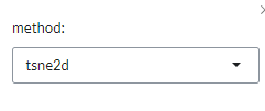
Dimensionality reduction maps colored by WGCNA module. Via the settings icon, the layout can be changed between tsne (default), pca and umap.
- Module graph:
The final panel contains the raph network of WGCNA modules, which represents the relationship betweem of the gene modules.
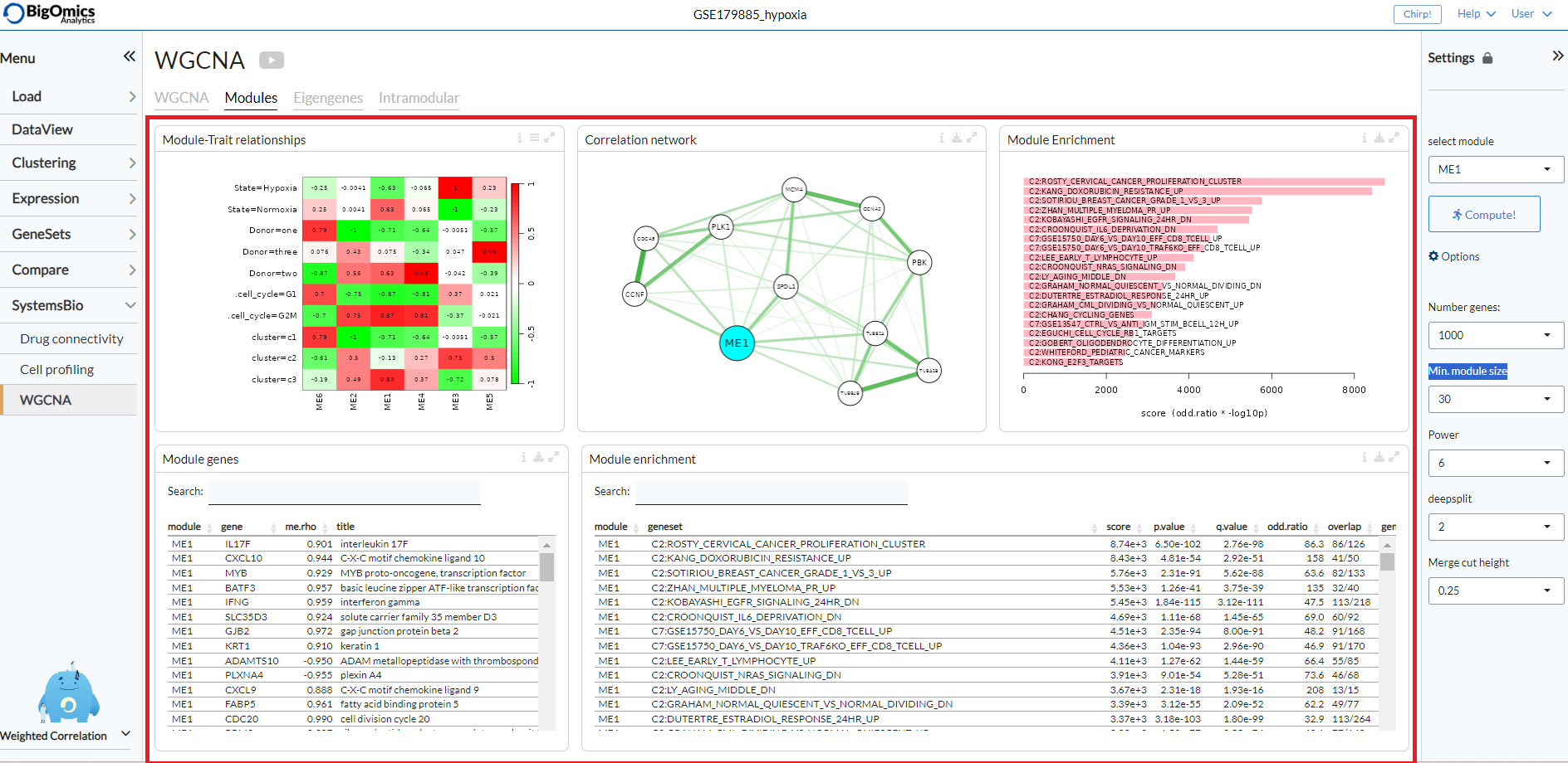
Modules
The Modules tab contains five panels (left to right, top to bottom): Module-Trait relationships, Correlation network, Module Enrichment (plot), Module genes and Module enrichment (table).
- Module-Trait relationships:
Module-trait analysis identifies modules that are significantly associated with the measured clinical traits by quantifying the association as the correlation of the eigengenes with external traits. The relationships between the various WGCNA modules and the phenotypic groups in the dataset are displayed as a heatmap, with shades of red indicating a negative correlation and shades of green indicating a positive correlation. The continuous variables can be binarised via the settings icon (
binarize continuous vars).
- Correlation network:
A partial correlation graph centered on module eigengene with top most correlated features. Green edges correspond to positive (partial) correlation, red edges to negative (partial) correlation. Width of the edges is proportional to the correlation strength of the gene pair. The regularized partial correlation matrix is computed using the ‘graphical lasso’ (Glasso) with BIC model selection.
- Module Enrichment Plot:
A plot that displays the functional enrichment of top most enriched genesets from a selection of GO and MSigDB genesets.
- Module genes:
A table showing the genes in the WGCNA module selected via the Settings panel. The value me.rho represents the correlation between the gene expression and the module.
- Module Enrichment Table:
Functional enrichment of the module calculated using Fisher’s exact test. In this table, users can check mean expression values of features across the conditions for the selected module.
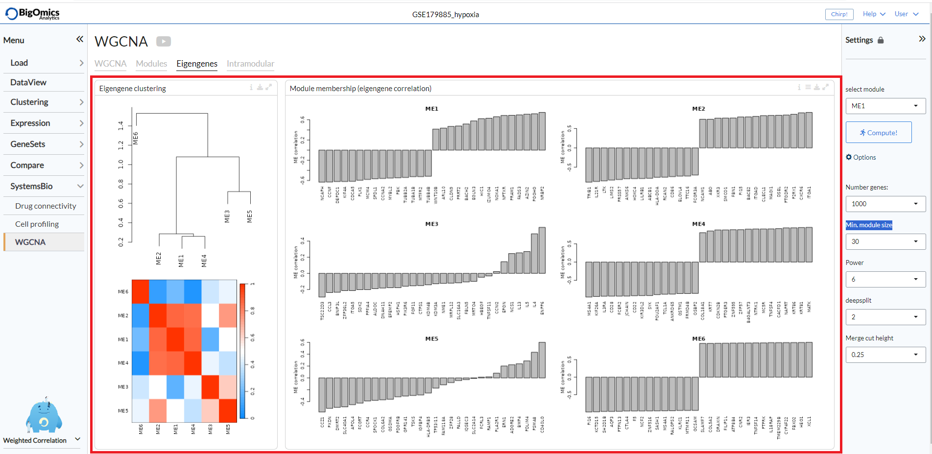
Eigengenes
The Eigengenes tab is used to visualise the network of eigengenes and study the relationships among the found modules. One can use the eigengenes as represetative profiles and quantify module similarity by eigengene correlation. For each module, we also define a quantitative measure of ‘module membership’ (MM) as the correlation of the module eigengene and the gene expression profile. This allows us to quantify the similarity of all genes to every module.
The tab contains two panels: Eigengene clustering and Module membership (eigengene correlation).
- Eigengene clustering:
A cluster heatmap that shows the relationship between the different modules produced by the platform.
- Module membership (eigengene correlation):
This panels contains a series of plots for each one of the generated modules. For each module, we define a quantitative measure of module membership (MM) as the correlation of the module eigengene and the gene expression profile. This allows us to quantify the similarity of all genes on the array to every module. Users can also select to include the
covariancefor each gene (default:off).
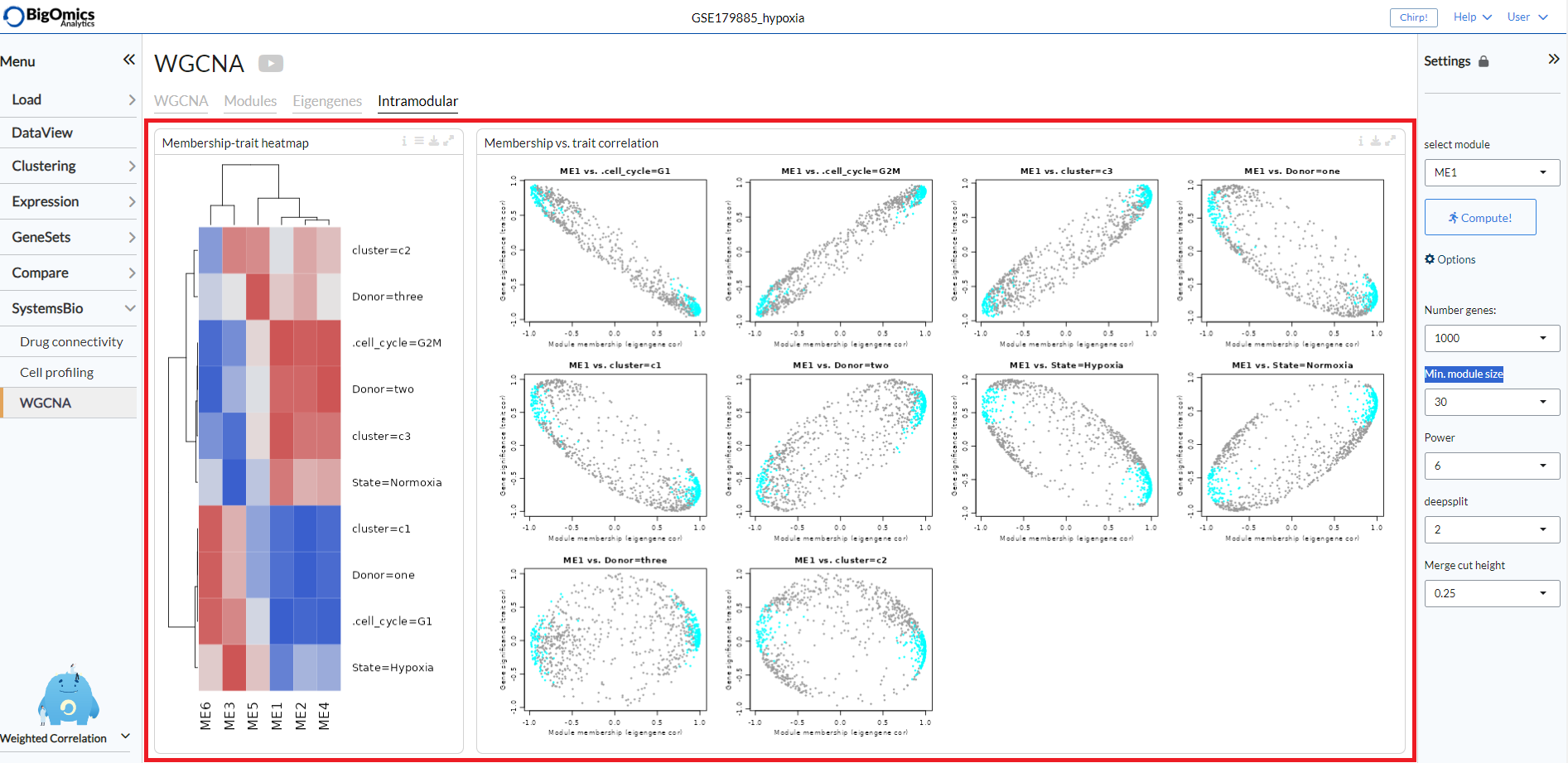
Intramodular
The Intramodular tab is used to quantify associations of individual genes with the trait of interest (weight) by defining Gene Significance (GS) as (the absolute value of) the correlation between the gene and the trait. For each module, a quantitative measure of module membership (MM) as the correlation of the module eigengene and the gene expression profile is also defined. Using the GS and MM measures, users can identify genes that have a high significance for weight as well as high module membership in interesting modules.
The tab contains two panels: Membership-trait heatmap and Membership vs. trait correlation.
- Membership-trait heatmap:
For each module, a quantitative measure of module membership (MM) as the correlation of the module eigengene and the gene expression profile is defined. This allows us to quantify the similarity of all genes on the array to every module and represent them as a heatmap.
- Membership vs. trait correlation:
In this panel, the MM and trai correlations are represented as a series of scatterplots.