Expression
The Expression module is divided into three submodules. The Differential Expression panel compares expression between two conditions (i.e. tumor versus control), which is one of the fundamental analysis in the transcriptomics data analytics workflow. For each comparison of two conditions (also called a ‘contrast’), the analysis identifies which genes are significantly downregulated or overexpressed in one of the groups.
The Correlation Analysis submodule computes the correlation between genes and finds coregulated modules.
Finally, the Find biomarkers submodule is used to identify potential biomarkers for a set of phenotypic groups based on gene or protein expression values.
Differential expression
Settings panel
The settings panel on the right contains some settings for the analysis.
Users can start the differntial expression (DE) analysis by selecting a contrast
of their interest in the Contrast setting and specifying a relevent gene family in the
Gene family setting. It is possible to set the false discovery rate (FDR) and the
logarithmic fold change (logFC) thresholds under the FDR and logFC threshold settings, respectively.
Under “Options”, users can select to display all genes in the table (not only significant genes)
and also select different combinations of statistical methods for the analysis.

Table
The Differential expression analysis table shows the results of the statistical tests slected in the
Statistical methods. By default, this table reports
the meta (combined) results of
DESeq2 (Wald),
edgeR (QLF), and
limma (trend) only.
Users can filter top N = {10} differently expressed genes in the table by
clicking the top 10 genes and also show the q-values from individual statistical methods
by ticking show individual q-values from the table Settings.
For a selected comparison under the Contrast setting, the results of the selected
methods are combined and reported in the Differential expression analysis table, where meta.q for a gene
represents the highest q value among the methods and the number of stars for
a gene indicate how many methods identified significant q values (q < 0.05).
The table is interactive (scrollable, clickable); users can sort genes by logFC,
meta.q, or average expression in either conditions.
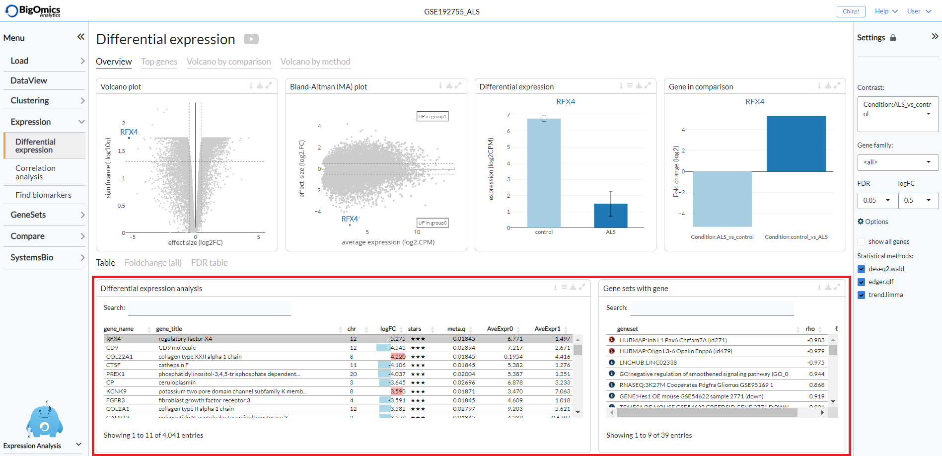
By clicking on a gene in the the Differential expression analysis table (highlighted in grey in the figure),
it is possible to see the correlation and enrichment value of gene sets that
contain the gene in the the Gene sets with gene table.
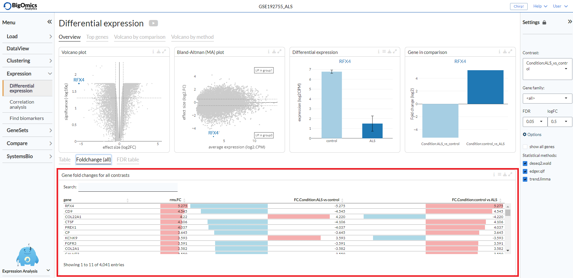
Foldchange (all)
The Foldchange (all) tab reports the gene fold changes for all contrasts in the selected dataset.
The column fc.var corresponds to the variance of the fold-change across all contrasts.
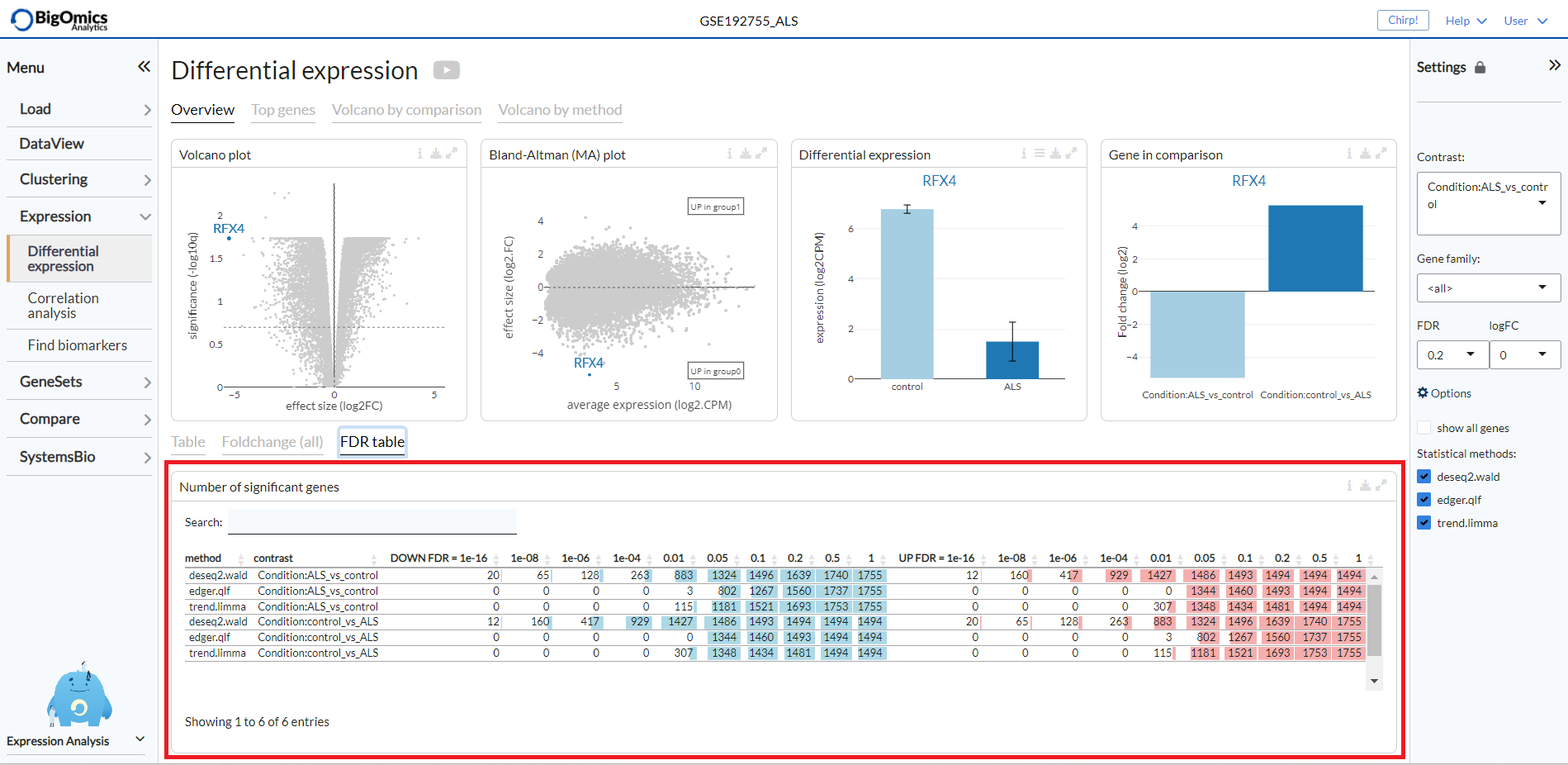
FDR table
The FDR table tab reports the number of significant genes at different FDR thresholds for all contrasts and methods within the dataset. This enables to quickly see which methods are more sensitive. The left part of the table (in blue) correspond to the number of significant down-regulated genes, the right part (in red) correspond to the number of significant overexpressed genes.
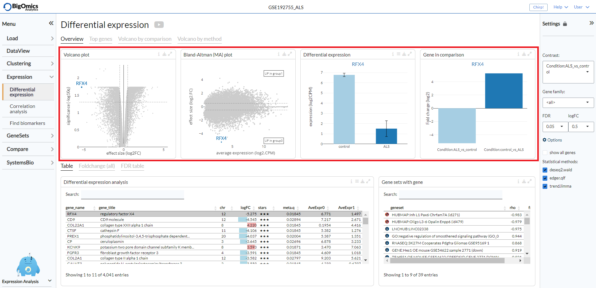
Overview Plots
The Overview tab shows on top the following plots (from left to right):
- Volcano Plot:
An interactive volcano plot for the chosen contrast. Unless a specific gene is selected from the differential expression analysis table, all significant genes are highlighted in blue.
- Bland-Altman (MA) plot:
An interactive MA plot for the chosen contrast. Unless a specific gene is selected from the differential expression analysis table, all significant genes are highlighted in blue.
- Differential expression:
Differential expression boxplot for a gene that is selected from the differential expression analysis table. Users can customise the plot via the settings icon on top to ungroup samples and change the scale to counts per million (CPM).
- Gene in comparison:
Fold change summary barplot across all contrasts for a gene that is selected from the differential expression analysis table.
Top genes
The Top genes tab shows the average expression plots across the samples for the top differentially
(both positively and negatively) expressed genes for the selected comparison from the Contrast setting.
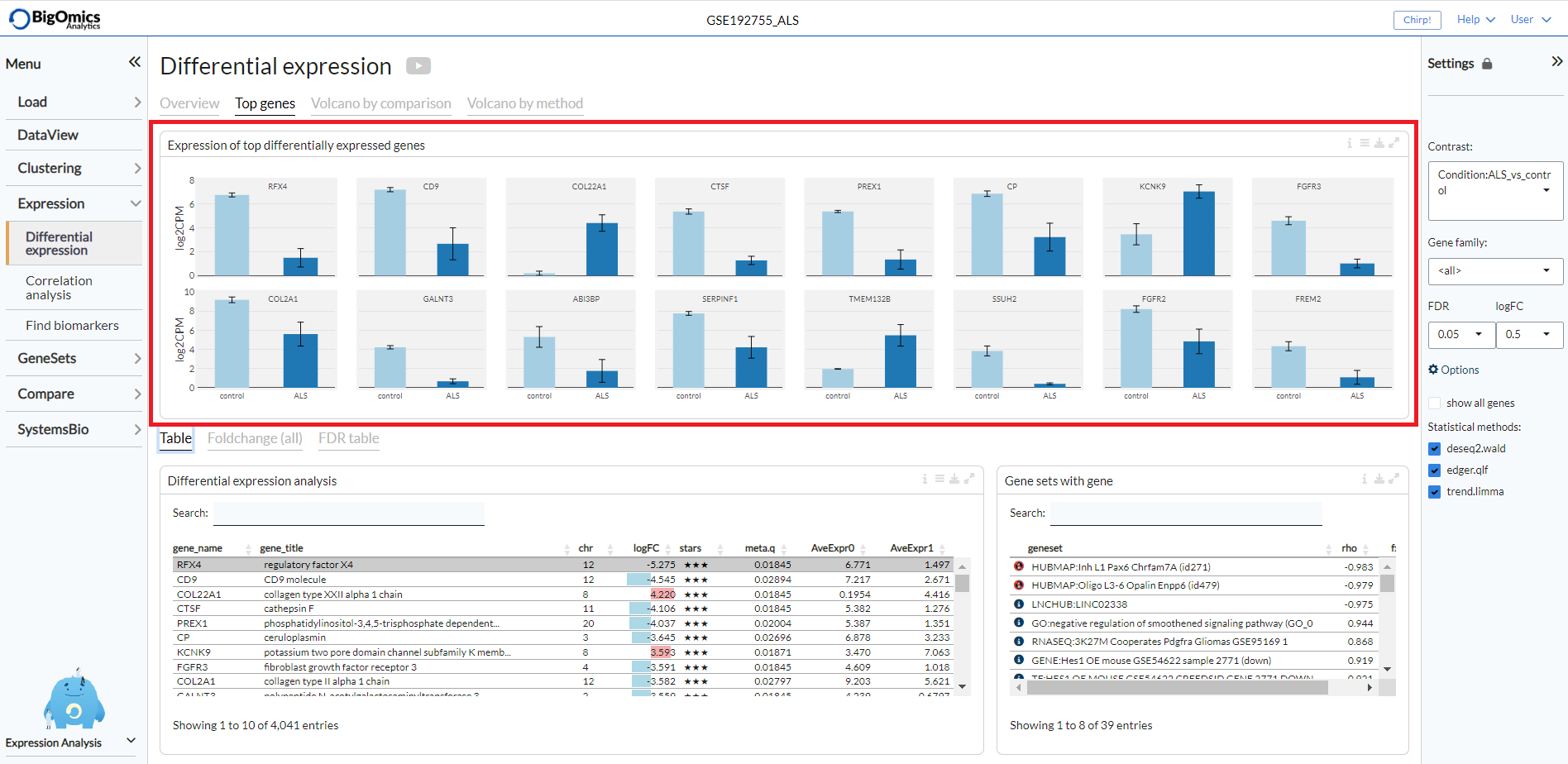
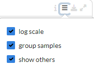
The plot can be customised via the settings to remove the log scale, group samples and show only samples included in the selected contrast.
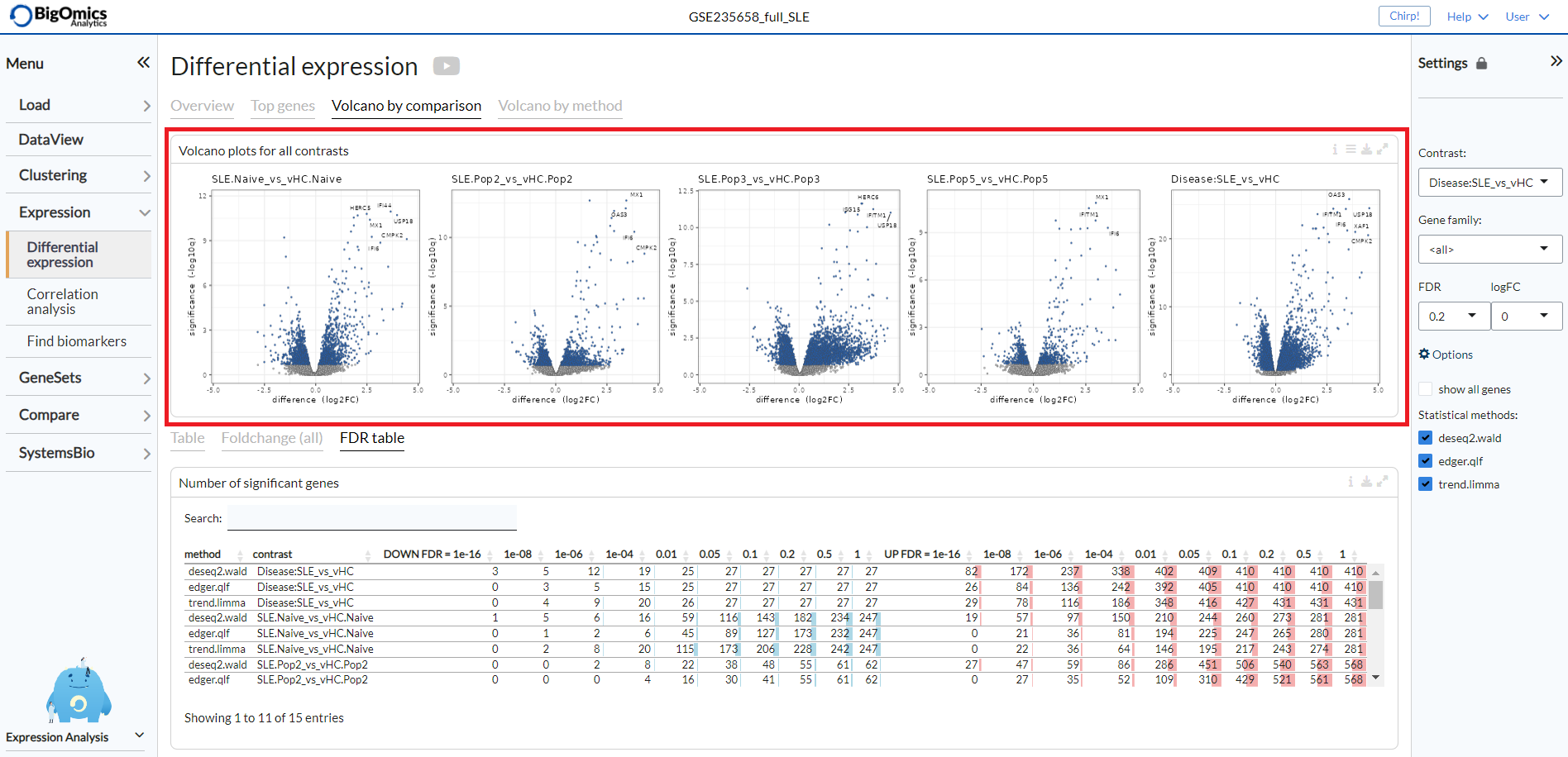
Volcano by comparison
Under the Volcano by comparison tab, the platform simultaneously displays multiple volcano plots for genes across all contrasts. By comparing multiple volcano plots, the user can immediately see which comparison is statistically weak or strong. Experimental contrasts with better statistical significance will show volcano plots with ‘higher’ wings.
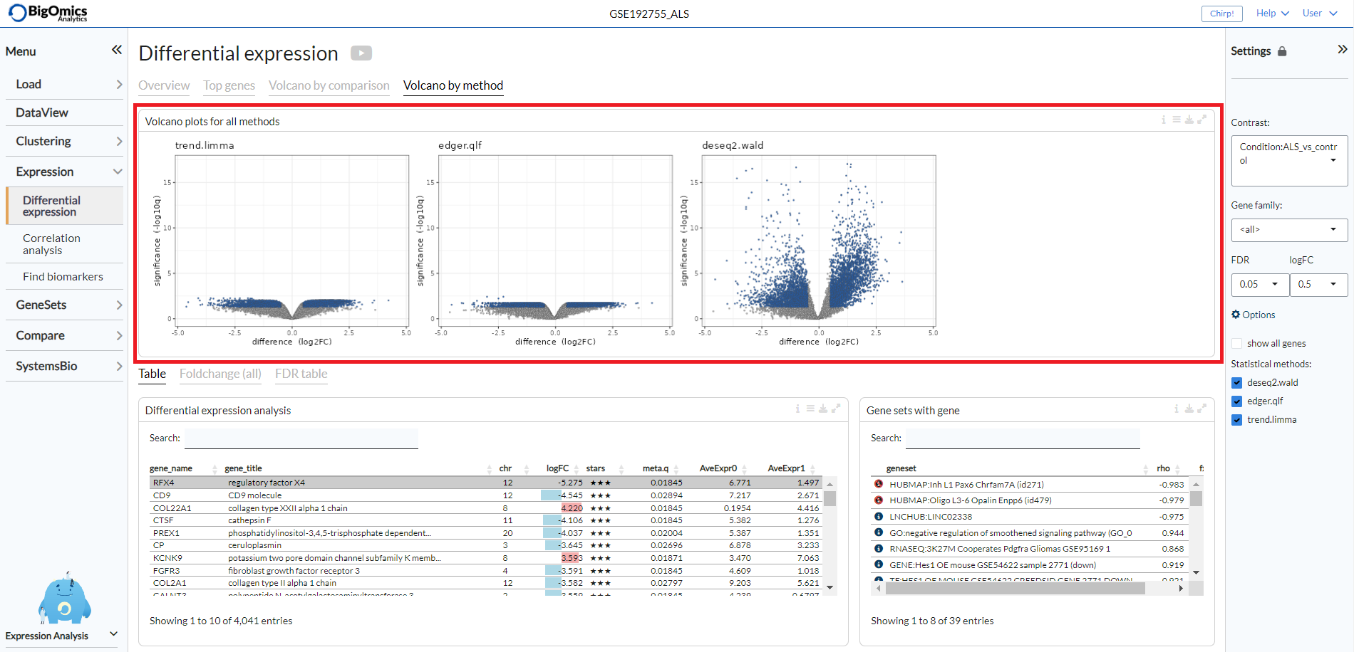
Volcano by method
Under the Volcano by method tab, the platform displays the volcano plots provided by multiple differential expression calculation methods for the selected contrast. Methods showing better statistical significance will show volcano plots with ‘higher’ wings.
Correlation analysis
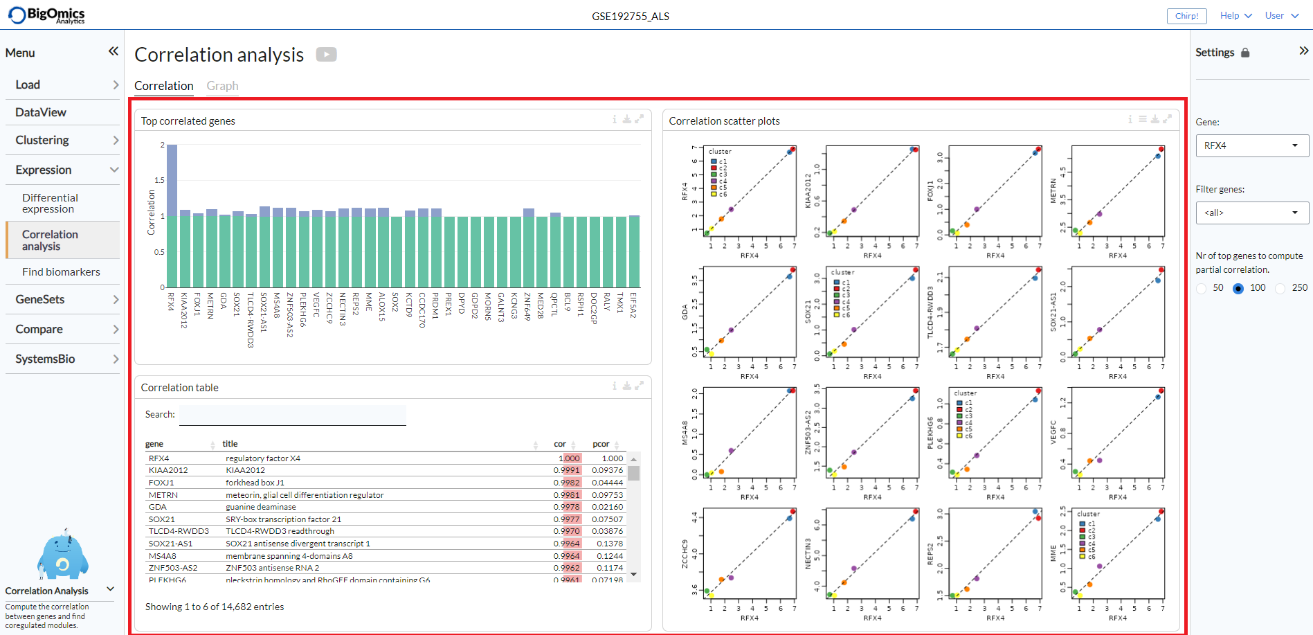
Settings panel
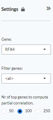
The panel contains the main settings for the analysis. The analysis can be started
by selecting a gene of interest from the Gene settings. Users can
filter for a specific gene family by using the Filter genes setting.
Finally, users can select the number of top genes used to compute partial correlation
under the homonymous setting.
Correllation
Under the Correlation tab, the platform displays three different outputs:
- Top correlated genes:
A plot displaying the highest correlated genes in respect to the selected gene.
- Correlation scatter plots:
Pairwise scatter plots for the co-expression of correlated gene pairs across the samples.
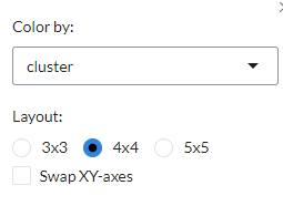
The straight line correspond to the (linear) regression fit. Using the settings on top, the plot can be customised
by changing the colour of the gene pairs by phenotype using the Colour by option. Users can also change the layout of
the plots under ``Layout`.
- Correlation table:
it shows the statistical results from correlated gene pairs.
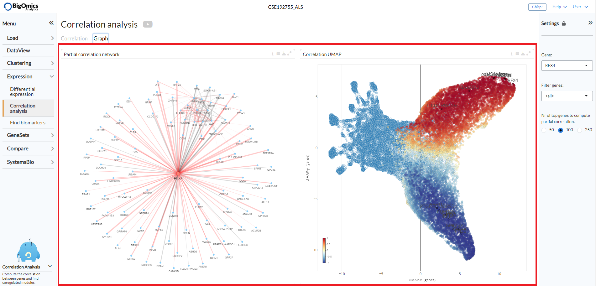
Graph
Two plots are generated under the Graph tab:
- Partial correlation network:
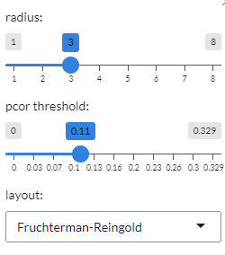
This plot shows the correlations between gene pairs. Grey edges correspond to positive correlation, red edges correspond to negative correlation. The width of the edge is proportional to the absolute partial correlation value of the gene pair. It can be customised from the plot settings, where the radius of the plot and the partial correlation threshold (
pcor threshold) can be altered. Users can also the choose from four different layouts (Fruchterman-Reingold, Kamada-Kawai, graphopt and tree layout) under theLayoutoption.
- Correlation UMAP:
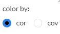
UMAP plot showing the correlation between genes. Genes that are correlated are generally positioned close to each other. Red corresponds to positive correlation/covariance, blue to negative. User can select whether to colour the genes by correlation or covariance in plot settings.
The Partial correlation network is on the left, while the Correlation UMAP is on the right of the page.
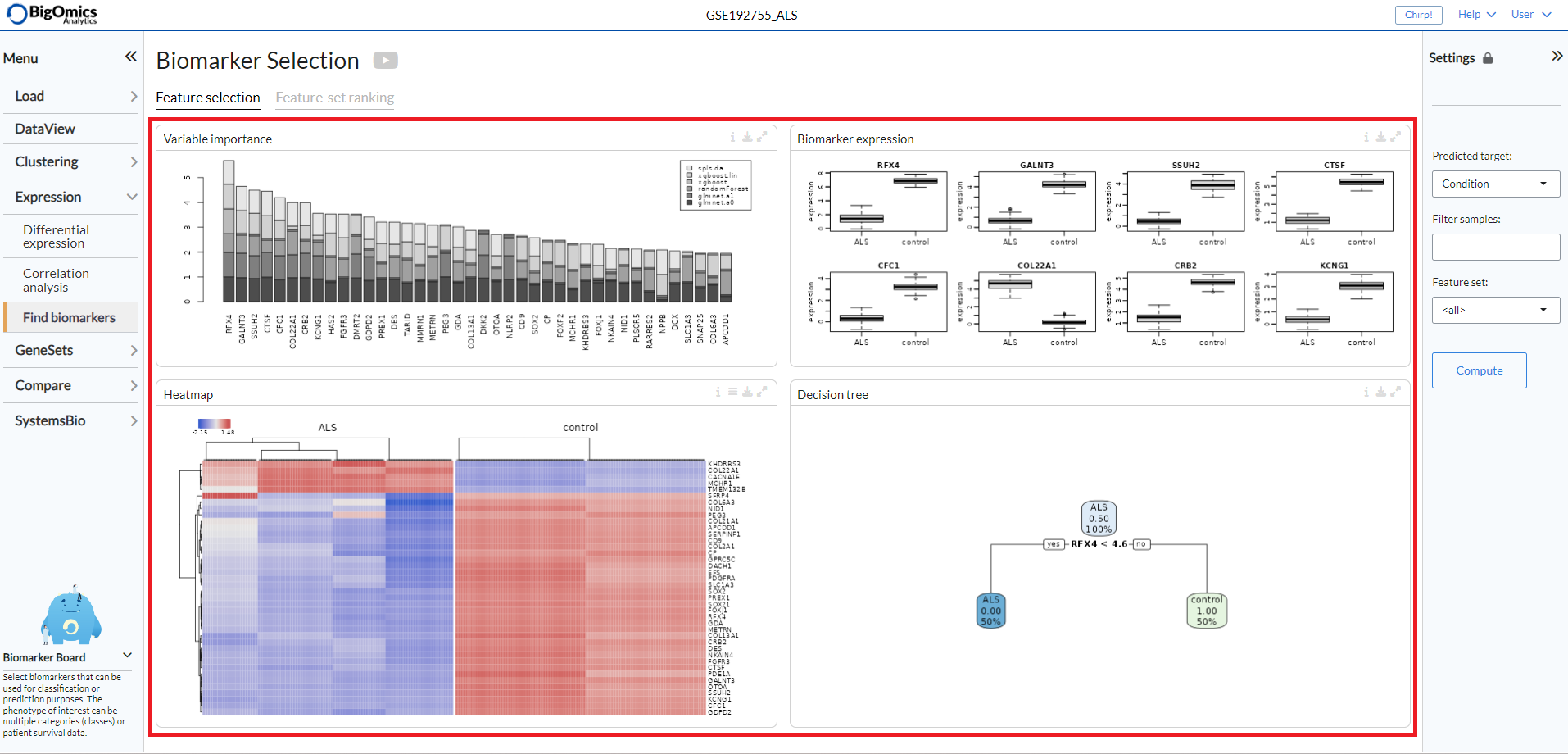
Find Biomarkers
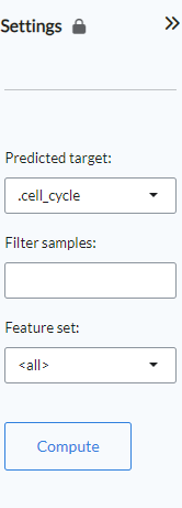
Settings panel
The panel contains the main settings for the analysis. Users select the phenotype on which to
perform the analysis with the Predicted target setting. In the Filter samples setting users
can restrict the analysis to a subset of samples rather than the default choice of all samples.
The Feature set setting will by default be set to “all”, but users can restrict the calculations
only to a specific gene family or, alteratively, they can paste their own selection of genes. Once all
the settings have been assigned, clicking Compute will start the calculation.
Feature Selection
Four panels (from left to right and top to bottom) are present under the Feature Selection tab:
- Variable Importance:
Omics Playground calculates a variable importance score for each feature using multiple state-of-the-art machine learning algorithms, including LASSO, elastic nets, random forests, and extreme gradient boosting. Note that we do not use the machine learning algorithms for prediction but we use them just to compute the variable importances according to the different methods. An aggregated score is then calculated as the cumulative rank of the variable importances of the different algorithms. By combining several methods, the platform aims to select the best possible predictive features. The top features are determined as the features with the highest cumulative ranks. .
- Biomarker Expression:
These boxplots shows the expression of putative biomarkers across the samples of the identified features.
- Heatmap:
Expression heatmap of top gene features according to their variable importance. By default the plot will only show the selected samples, but all samples can be displayed via the settings button on top.
- Decision tree:
The decision tree shows a tree solution for classification based on the top most important features. The plot provides a proportion of the samples that are defined by each biomarker in the boxes.
Feature-set Ranking
This tab consists of a single plot, the aptly named Feature-set Ranking, which displays the ranked discriminant score for top feature sets. The plot ranks the discriminative power of the feature set (or gene family) as a cumulative discriminant score for all phenotype variables. In this way, we can find which feature set (or gene family) can explain the variance in the data the best.
Users can choose between three different methods for the calculation of the plot. P-value based scoring (‘p-value’) is computed as the average negative log p-value from the ANOVA test. Correlation-based discriminative power (‘correlation’) is calculated as the average 1-cor between the groups. Thus, a feature set is highly discriminative if the between-group correlation is low. The ‘meta’ method combines the scores of the two aforementioned methods in a multiplicative manner.