Clustering
The Clustering module performs unsupervised clustering analysis of the data. After having done the QC, it is probably the first way to explore your data. The main purpose is to discover patterns and subgroups in the data, show correlation with known phenotypes, detect outliers, or investigate batch effects.
The module is divided into two submodules: Samples and Features.
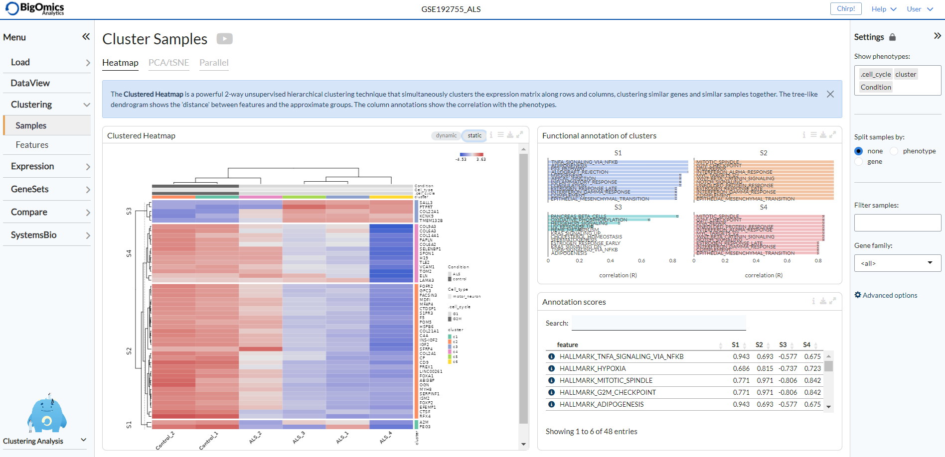
Under the Samples submodule you can find classical clustering functions. In the Heatmap panel hierarchical clustering can be performed on gene level or gene set level. The PCA/tSNE panel shows unsupervised clustering of the samples in 2D/3D as obtained by PCA or tSNE algorithms. The Parallel panel displays the expression levels of selected genes across all conditions. On the right, the Annotate cluster panel provides a functional annotation for each feature cluster in the heatmap. Users can select from a variety of annotation databases from the literature. The Phenotypes panel shows the phenotype distribution as colors on the t-SNE plot. Finally, the Feature ranking panel shows a plot that ranks the discriminative power of feature sets (or gene sets) as the cumulative discriminant score for all phenotype variables.
The Features submodule performs clustering at either the gene level (Gene panel) or at the geneset level (Geneset panel). For both a gene or geneset UMAP plot is displayed, next to a “Gene Signatures” UMAP plot, where users can visualise specific phenotypes. Finally, below the plots, a table contains eithe the genes or genesets in a given selected area.
Samples
Settings panel
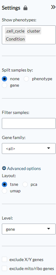
The settings panel on the right displays various options to customise the plots.
Under Show phenotypes users can choose which phenotypes will be displayed in the
Phenotype distribution plot under the PCA/tSNE panel.
The Split samples by option applies only to heatmaps. “None” is the default view,
“phenotypes” will redraw the heatmap based on the selected phenotype and “gene” allows
users to split the heatmap based on the expression level of a gene that can be selected
from a scrolldown menu. Filter samples can be used to represent only a specific
subset of samples in the heatmaps, PCA/tSNE/UMAP plots and the parallel coordinates plot.
Under Gene family a user can select whether the heatmap and parallel coordinates plot
will be built based on all the genes, a specific contrast, a specific gene family
or alternatively a custom list of genes provided by the user that can be pasted
in the appropriate space.
Furthermore, under Advanced options, users can choose the layout of the clustering
plots (PCA, tSNE or UMAP), the level of analysis (gene or geneset) and exclude
mitochondrial and ribosomal genes and/or genes in the X and Y chromosomes.
Heatmap
In the Heatmap panel hierarchical clustering can be performed on gene level or gene set level expression. For the latter, for each gene set (or pathway), a single-sample enrichment value is computed from the gene expression data using summary methods such as GSVA and ssGSEA.
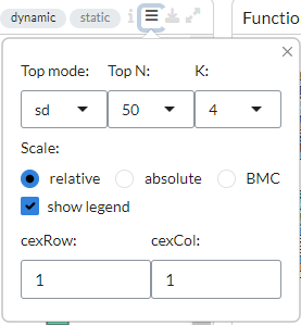
Next to the plot configuration settings, users can select between a “dynamic” or “static” heatmap.
From the plot configuration settings on top of the plot, users can choose various options to
customise their heatmaps. It is possible to order the top features under top mode as follows:
sd - features with the highest standard deviation across all the samples,
PCA - by principal components.
marker - features that are overexpressed in each phenotype class compared to the rest
In addition, users can specify the Top N (50, 150, 500) genes to be used
in the heatmap and the number of gene clusters to be displayed under K.
Users can also choose between ‘relative’, ‘absolute’ or ‘BMC’ (batch-mean centered) expression
scale. Under the CexCol and CexRow settings, it is also possible to adjust the font sizes
for the column and row labels. The legend in the heatmap can be disabled by unticking the
show legend option.
The complex heatmap below is generated with the “static” option active. It is a clustered heatmap showing gene expression sorted by 2-way hierarchical clustering. Red corresponds to overexpression, blue to underexpression of the gene. At the same time, gene clusters are functionally annotated in the Annotate clusters panel on the right.
Activating the “dynamic” option generates an interactive version of the clustered heatmap. Users should be aware that for large datasets (such as single-cell RNA-seq data) this plot can become rather slow.
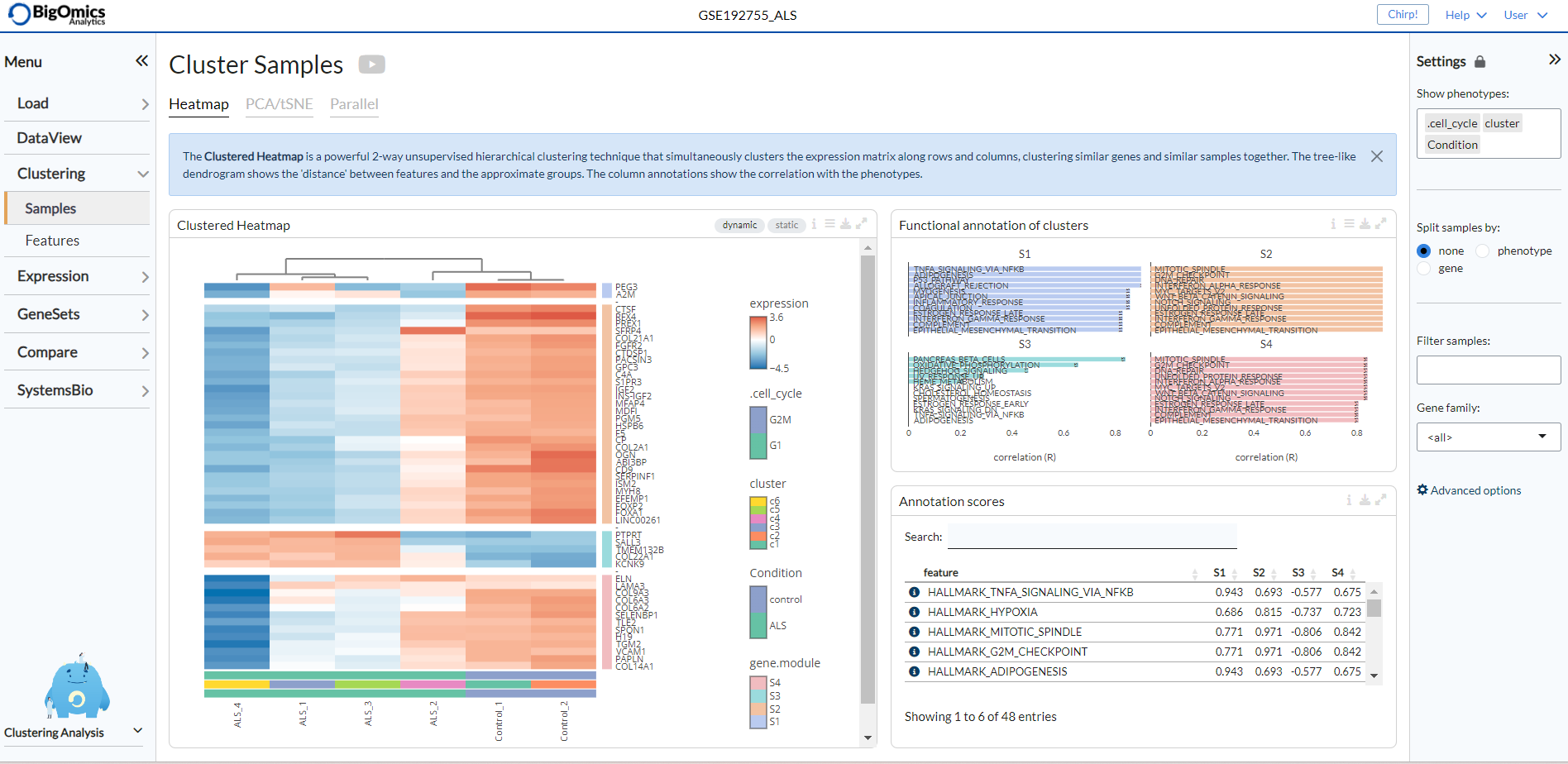
Annotate clusters
The features in the heatmap are divided into clusters depending on the
selected top mode in the heatmap panel settings. For each cluster,
the Annotate cluster section provides a functional annotation
using more than 42 published reference databases, including but not
limited to well-known databases such as MSigDB, Wikipathways, and GO. In the plot settings, users can
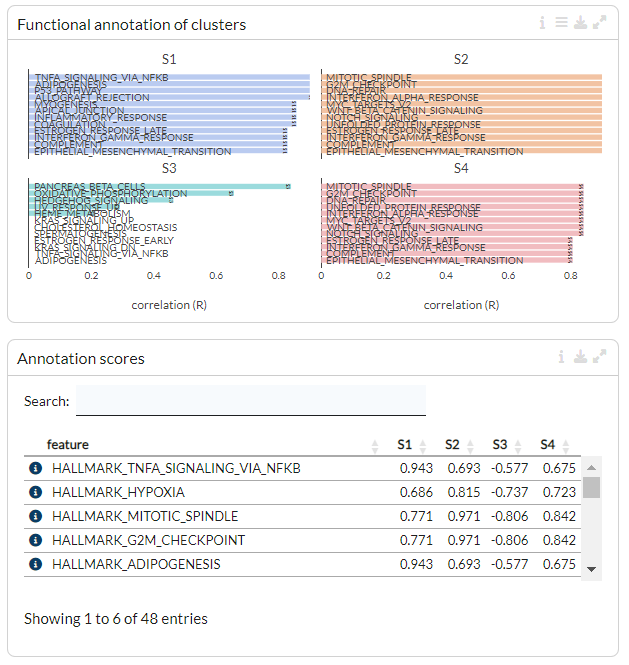
specify the level and reference set to be used under the Reference
level and Reference set settings, respectively.
Users can also select a Fisher test weighting for gene sets.
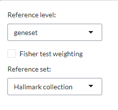
The functional annotation for the clusters are displayed below, with the highest ranking annotation features (by correlation) displayed for each gene cluster. Length of the bars corresponds to the average correlation of the cluster with the annotation term. In the table below the barplots, users can view the correlation values of annotation features for each cluster.
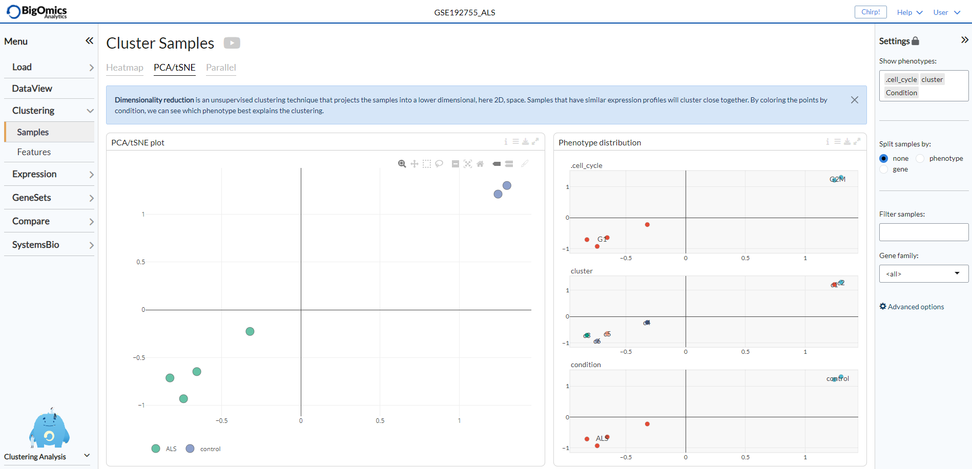
PCA/tSNE
The PCA/tSNE panel visualizes unsupervised clustering obtained by the principal components analysis (PCA), t-distributed stochastic embedding (tSNE) or Uniform Manifold Approximation and Projection (`UMAP <https://arxiv.org/abs/1802.03426>__) algorithms. This plot shows the relationship (or similarity) between the samples for visual analytics, where similarity is visualized as proximity of the points. Samples that are ‘similar’ will be placed close to each other.
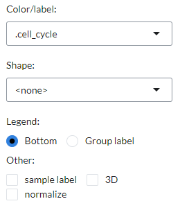
Users can customise the PCA/tSNE/UMAP plot in the plot settings, including
the color/label and shape of points using a phenotype class, the placement
of the plot legend at the bottom or as a group label, the inclusion of sample labels,
the choice between a 2D/3D plot display and the normalisation of the plot matrix.
To the right of the PCA/tSNE/UMAP plot (labelled as PCA/tSNE plot) the platform also generates a group of plots, entitled Phenotype distribution, that visualise the distribution of the available phenotype data. The plots show the distribution of the phenotypes superposed on the t-SNE clustering.
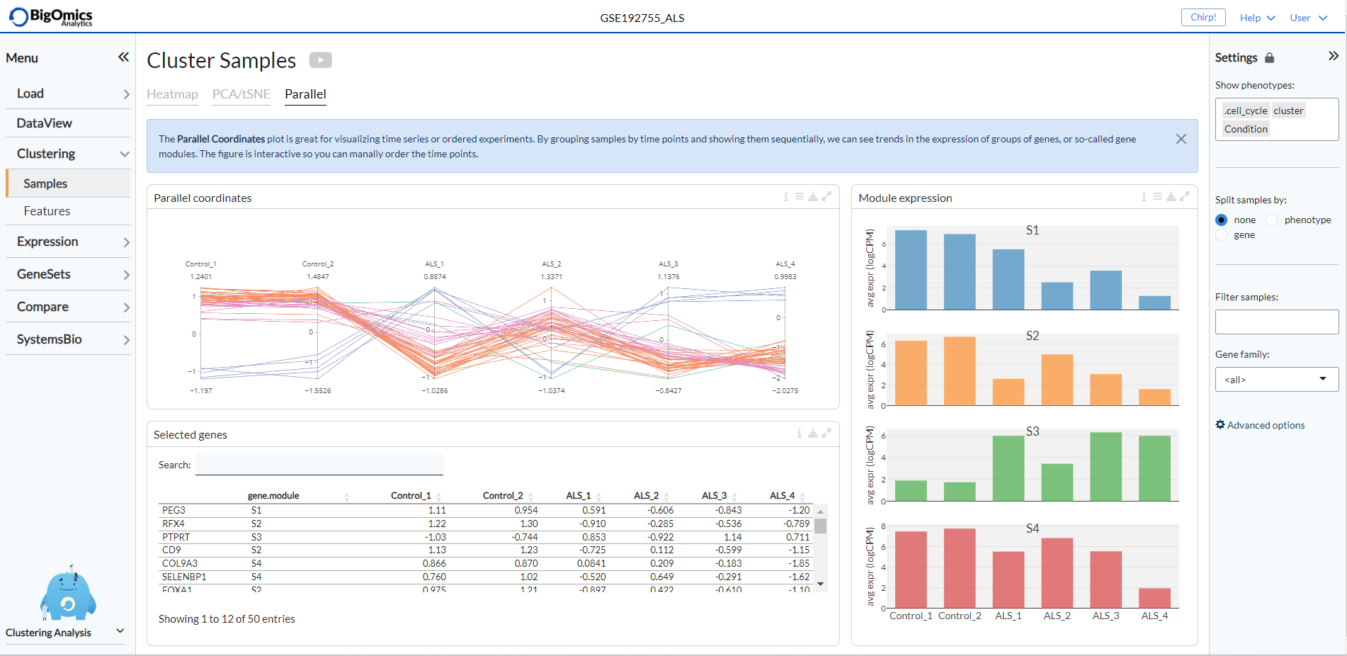
Parallel
The Parallel panel visualizes the expression levels of selected genes across
all conditions in the plot labelled Parallel coordinates. The expression values are
scaled but scaling can be removed via the plot settings, where gene expression levels
can also be averaged by gene module. This interactive plot is particularly useful to users
working with time series experiments, as samples can be grouped by condition (i.e. time) and ordered manually.
A table (named Selected genes) containing average expression levels of selected genes across conditions is generated
below the plot. Finally, to the right of the Parallel coordinates plot, a series of histograms
are group together in the Module expression panel and display the overal expression of each module
(the number of which is defined by the K value selected in the heatmap settings) by individual sample.
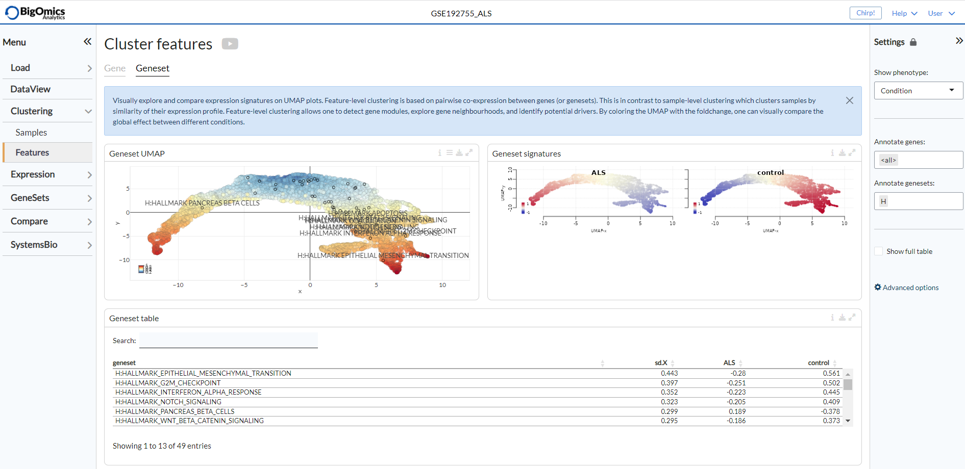
Features
Settings panel
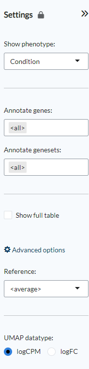
Using the Show phenotype option the phenotypes that will be shown
in the Gene signatures plots can be selected. Users can also select whether
to use all genes for the Gene UMAP plot or instead select a combination
of gene families under the Annotate genes option. The Annotate genesets
option provides the same functionality for the Geneset UMAP plot based on the available
geneset collections The Show full table option shows the full list of unfiltered genes
or genesets. Under the advanced options users can select which sample group to use as
a Reference to calculate the standard-deviation of log-expression (sd.X),
or standard-deviation of the fold-change (sd.FC). If none is selected, the average values
for all samples will be used instead. The final option, UMAP datatype, is used to select
how the UMAP plot will be computed: either using the normalised log-expression (logCPM)
or log-fold change matrix (logFC). logCPM is the default choice, while logFC can be used
if batch or tissue effects are present in the dataset,
Gene and Geneset UMAP settings
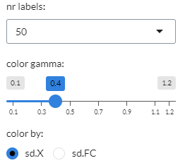
Both the Gene UMAP and Geneset UMAP panels display the same setting options, as shown below.
In it, users can use the color by option to select between standard-deviation of log-expression(sd.X)
or standard-deviation of the fold-change (sd.FC) to colour individual genes or genesets.
Users can also select the range of the colour intensity threshold using the color gamma option.
Finally, users can choose the number of gene or genesets to be labelled in the UMAP plot under nr labels.
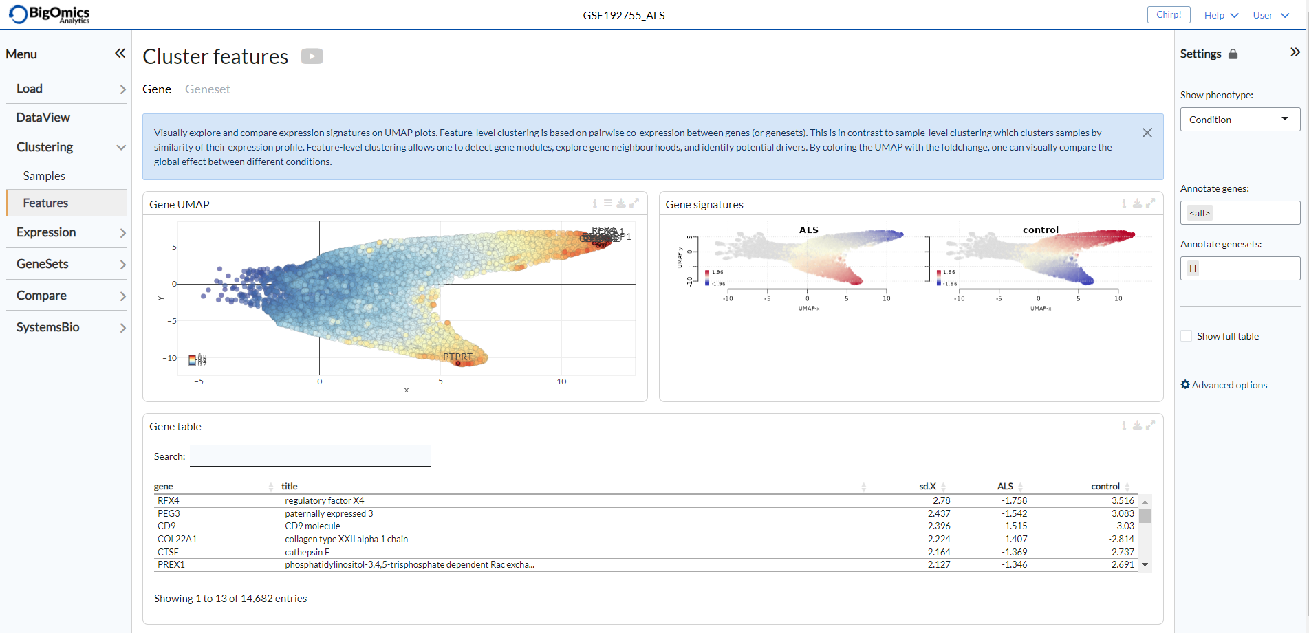
Gene
The Gene submodule contains three panels. The Gene UMAP panel displays the UMAP clustering of genes coloured by standard-deviation of log-expression(sd.X), or standard-deviation of the fold-change (sd.FC) and using the covariance of gene expression as a distance metric. The Gene signatures panel is to the right of the Gene UMAP, which shows the gene UMAP plots for each phenotypic group coloured by relative log-expression. Red indicates a gene is overexpressed in a specific group, blue that it is downregulated compared to the average values of all samples. The Gene table is located below the Gene UMAP and shows all the gene contained in the Gene UMAP plot and their relative change in expression. The contents of this table can be subsetted by selecting (by click&drag) on the Gene UMAP plot.
Geneset
The Geneset submodule contains three panels. The Geneset UMAP panel displays the UMAP clustering of genesets coloured by standard-deviation of log-expression(sd.X), or standard-deviation of the fold-change (sd.FC) and using the covariance of gene expression as a distance metric. The Geneset signatures panel is to the right of the Geneset UMAP, which shows the geneset UMAP plots for each phenotypic group coloured by relative log-expression. Red indicates a geneset is overexpressed in a specific group, blue that it is downregulated compared to the average values of all samples. The Geneset table is located below the Geneset UMAP and shows all the gene contained in the Geneset UMAP plot and their relative change in expression. The contents of this table can be subsetted by selecting (by click&drag) on the Geneset UMAP plot.